Progressive Enhancement
Progressive enhancement is a technique in CSS that allows us to use cutting edge CSS styling but still has fallbacks to support older browsers. With progressive enhancement, we can use things like Grid and Flexbox without having to worry about browsers that don't support the syntax for those tools.
Mobile First Design
Mobile first design is a popular practice for developing web applications. The idea is that you build your styling to accommodate the smallest screens first and then use media queries to alter the original design as screen sizes get larger. This allows your content to be flexible so that your application looks good on any device your user may be using to access it.
Let's get started with this example.
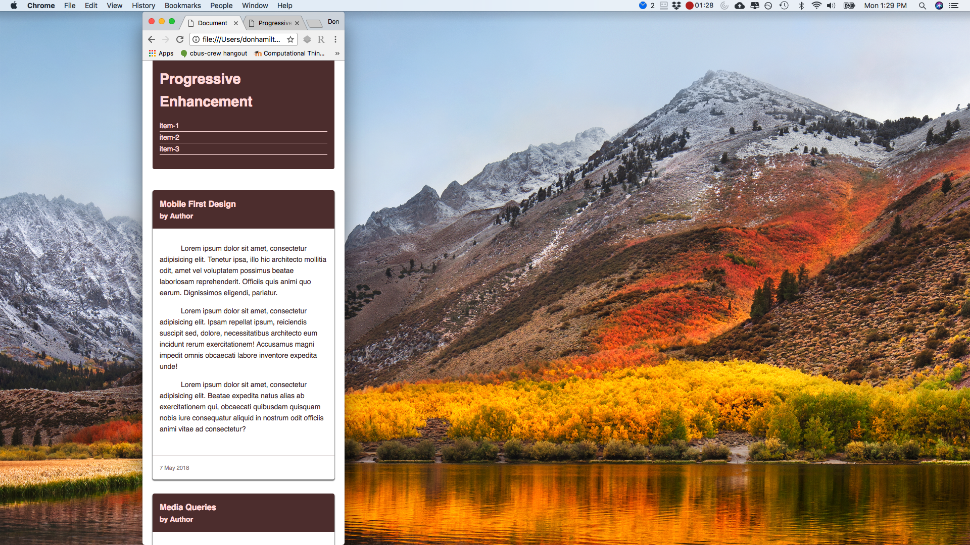
Getting Started
In our example, you can see we have a basic site set up for mobile devices. We are going to see how we can add complexity to our code as we scale up.
Media Queries
The first thing we are going to take a look at are media queries. Media queries allow us to alter our style rules based on conditions like viewport height or width, orientation of the screen (portrait or landscape), or what type of display we're dealing with.
Let's begin by adding a media query for when the viewport is at least 600px and make some columns for our content.
@media screen and (min-width: 600px) {
	article {
		float: left;
		margin-right: 2%;
		width: 49%;
	}
	article:nth-child(even) {
		margin-right: 0;
	}
	.clearfix::after {
		clear: both;
		content: '';
		display: block;
	}
}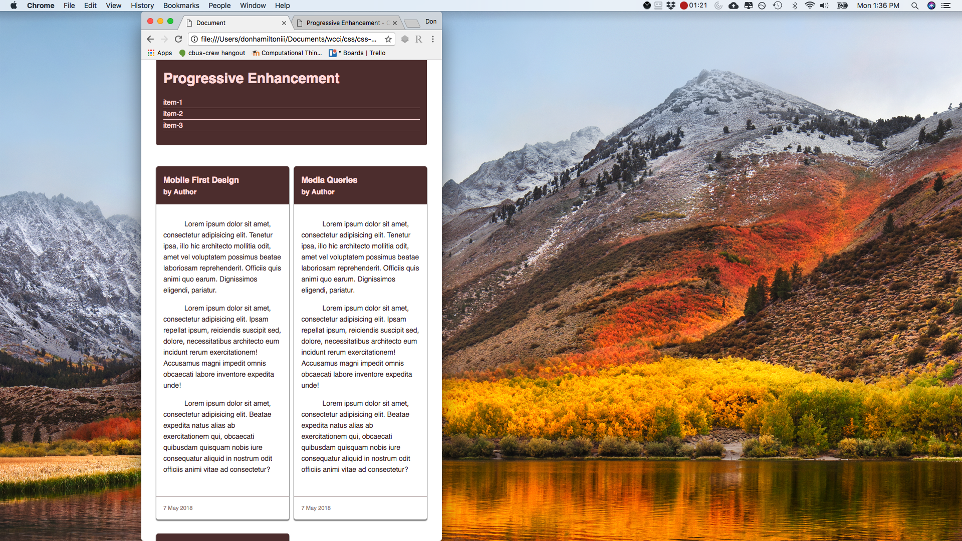
Notice how we now have a two column layout when our viewport is at least 600px wide. Let's continue to make more columns as our screen gets larger. Let's add another media query for 900px.
@media screen and (min-width: 900px) {
article {
margin-right: 2%;
width: 32%;
}
/* Overwrite previous media query */
article:nth-child(even) {
margin-right: 2%;
}
article:nth-child(3n) {
margin-right: 0;
}
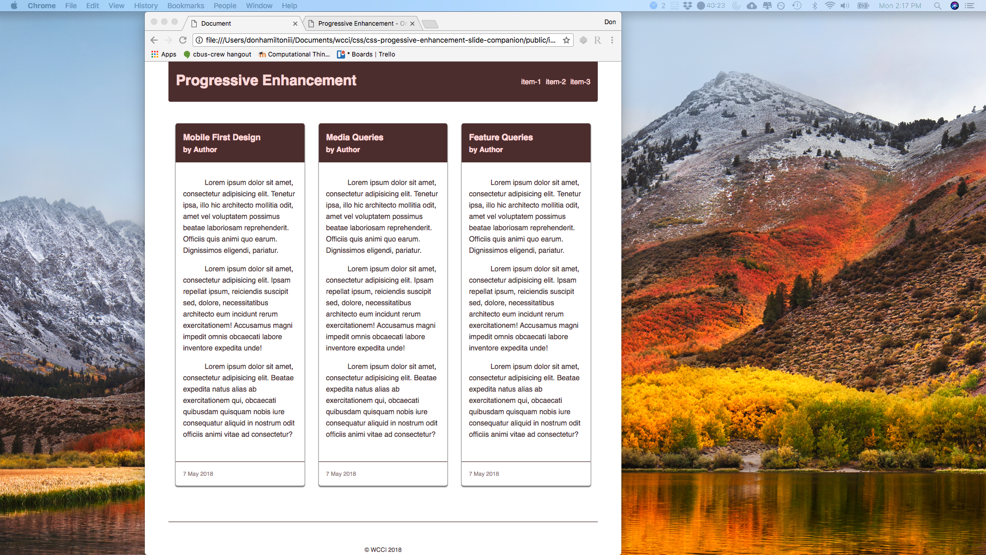
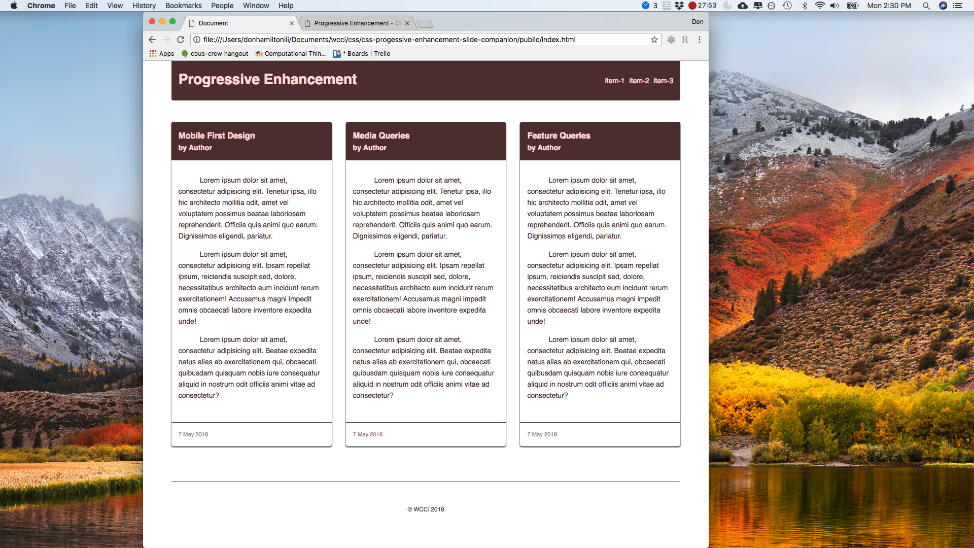
}Responsive Columns
Notice now that we have a three column layout when our viewport is at least 900px wide.
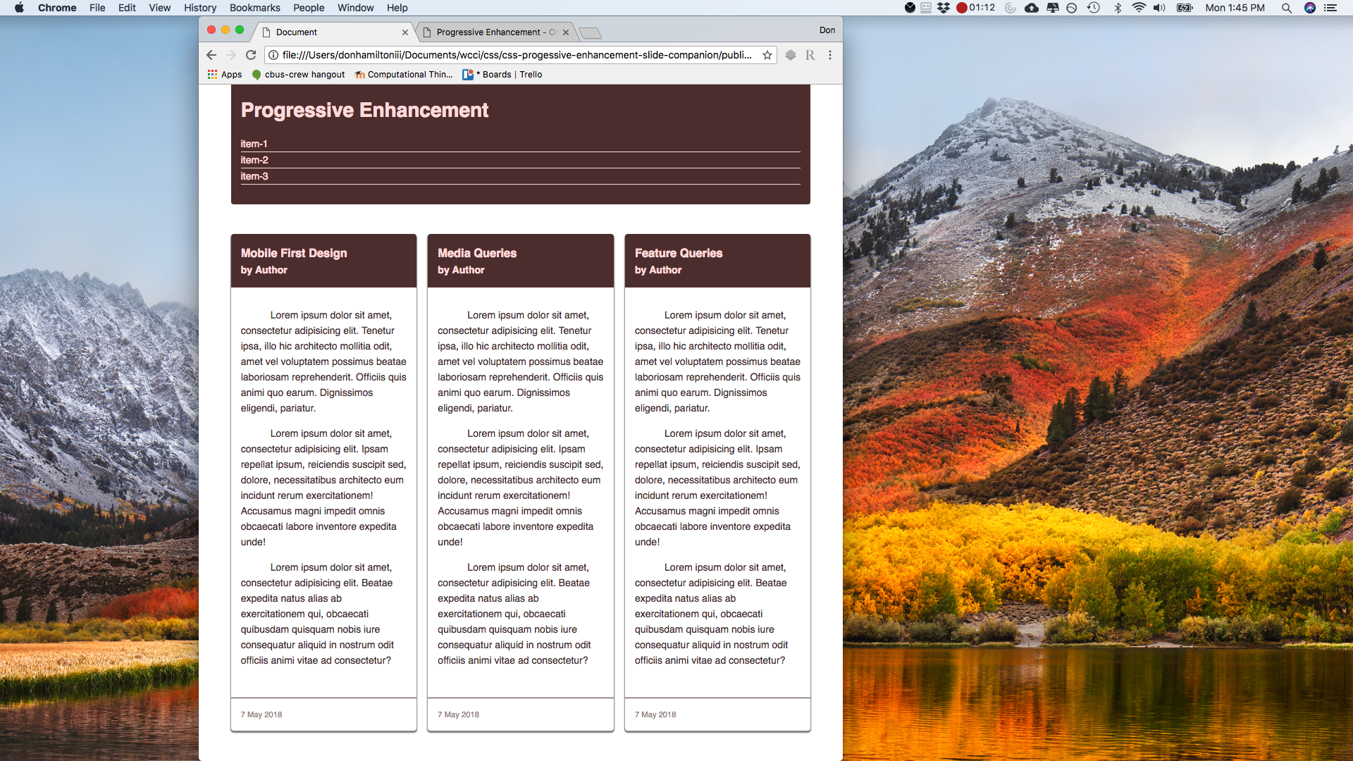
We can continue to add style rules to any given media query. Note that you can change any CSS rules inside of your media queries. So you could have an entirely different style for your page based on any conditions you want. Let's continue by arranging the navigation horizontally when the page is at least 750px wide.
@media screen and (min-width: 750px) {
	header h1 {
		float: left;
	}
	header nav {
		float: right;
	}
	nav ul li {
		border: none;
		display: inline-block;
		margin-right: 5px;
	}
	nav ul li:last-child {
		margin-right: 0;
	}
}
Feature Queries
Now that we have a flexible site, we can focus on making sure we are using the right tools for each job we're doing. Since we have layout tools like Grid and Flexbox now, we should be using those. The problem is that not all browsers support these new technologies so we need fall backs for them. That's why we're going to keep our percentage based layout and add Grid and Flexbox for browsers that support them using feature queries. Feature queries are similar to media queries with the exception that they check if a feature is supported in a browser instead of checking for specifications in the browser. Let's begin by adding support for flexbox when it is supported.
@supports (display: flex) {
	article:nth-child(even) {
		margin-right: 1rem;
	}
	article main {
		display: block;
	}
	article:nth-child(3n) {
		margin-right: 1rem;
	}
	main {
		display: flex;
		flex-wrap: wrap;
	}
	main article {
		float: none;
		margin: 0;
		margin: 0 1rem 2rem;
		flex: 1 1 250px;
		width: 100%;
	}
}
Grid
Now let's do the same for Grid
@supports (display: grid) {
	article main {
		display: block;
	}
	main {
		display: grid;
		grid-gap: 2rem;
		grid-template-columns: repeat(auto-fit, minmax(250px, 1fr));
	}
	main article {
		margin: 0;
	}
}
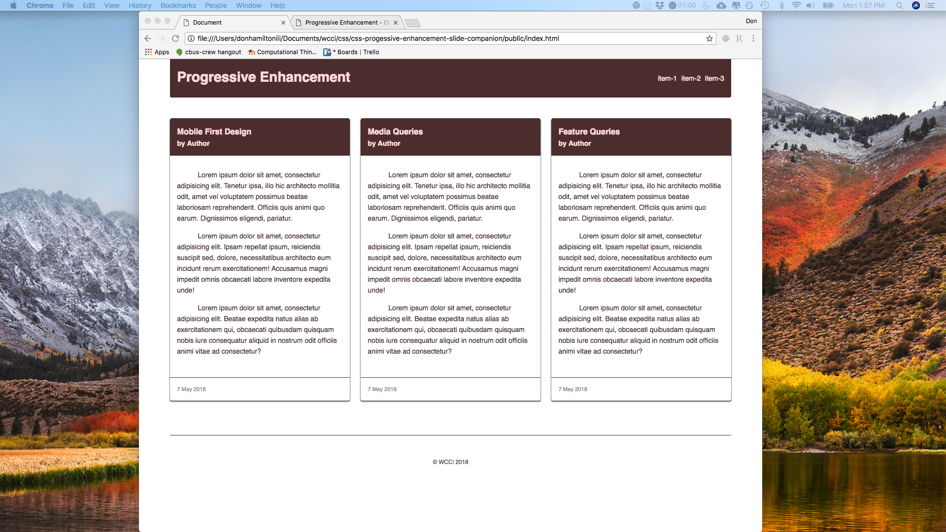
Progressively Enhanced Site
And there we have it. We have a site set up now that uses all of the new CSS rules that we have at our disposal without leaving any of our users out of the loop!